Supplier statistics widget
This widget is displayed on the Dashboard page and provides detection statistics over the specified period, grouped by supplier. The widget contains the following items:
- A badge with the total number of indicators in all suppliers
- A badge with the total number of detections for the indicators in all suppliers
In the Data management mode, clicking the badge opens the Detections page. There, the values are filtered according to the period specified in the dashboard settings.
- A badge with the total number of detections for false positive indicators in all suppliers (indicators belonging to the FalsePositive supplier)
This badge is shown only if the display of false positives is enabled in the dashboard settings.
In the Data management mode, clicking the badge opens the Indicators page. There, the values are filtered according to the period specified in the dashboard settings, with the False positives filter enabled.
- A table with statistics of detections for each supplier in use
The table contains the following columns:
- Supplier name
Name of an indicator supplier in use.
- The
 mark indicates that the supplier is not loaded or loaded partially due to certificate restrictions, or that the supplier is disabled in the feeds settings. Additionally, the name of such supplier is displayed in the light-gray color.
 - Last update date
Date and time of the last supplier update.
If an error occurs during an attempt to update a supplier, Kaspersky CyberTrace will display a notification about it.
- Indicators
Number of indicators in the supplier.
In the Data management mode, clicking a value in this column opens the Indicators page. There, the values are filtered according to the period specified in the dashboard settings and the selected supplier.
- Detected
Number of detections for the indicators in each supplier.
In the Data management mode, clicking a value in this column opens the Detections page. There, the values are filtered according to the period specified in the dashboard settings and the selected supplier.
- False positives
Number of detections for false positive indicators in each supplier (indicators belonging to the FalsePositive supplier).
This column is shown only if the display of false positives is enabled in the dashboard settings.
In the Data management mode, clicking a value in this column opens the Indicators page. There, the values are filtered according to the period specified in the dashboard settings and the selected supplier, with the False positives filter enabled.
- Supplier name
- A donut chart that presents the number of indicators for each supplier in use
This donut chart is displayed when the Indicators button is selected. Hover your mouse over a slice of the ring to view the supplier name, the number of indicators, and the percentage of total.
In the Data management mode, clicking a slice of this donut chart opens the Indicators page. There, the values are filtered according to the period specified in the dashboard settings and the selected supplier.
- A donut chart that presents the number of detections for each supplier in use
This donut chart is displayed when the Detected button is selected. Hover your mouse over a slice of the ring to view the supplier name, the number of detections, and the percentage of total.
In the Data management mode, clicking a slice of this donut chart opens the Detections page. There, the values are filtered according to the period specified in the dashboard settings and the selected supplier.
- A donut chart that presents the number of false positive indicators (indicators belonging to the FalsePositive supplier) for each supplier in use
This donut chart is displayed when the False positives button is selected. Hover your mouse over a slice of the ring to view the supplier name, the number of false positive indicators, and the percentage of total.
The button and donut chart are shown only if the display of false positives is enabled in the dashboard settings.
In the Data management mode, clicking a slice of this donut chart opens the Indicators page. There, the values are filtered according to the period specified in the dashboard settings and the selected supplier, with the False positives filter enabled.
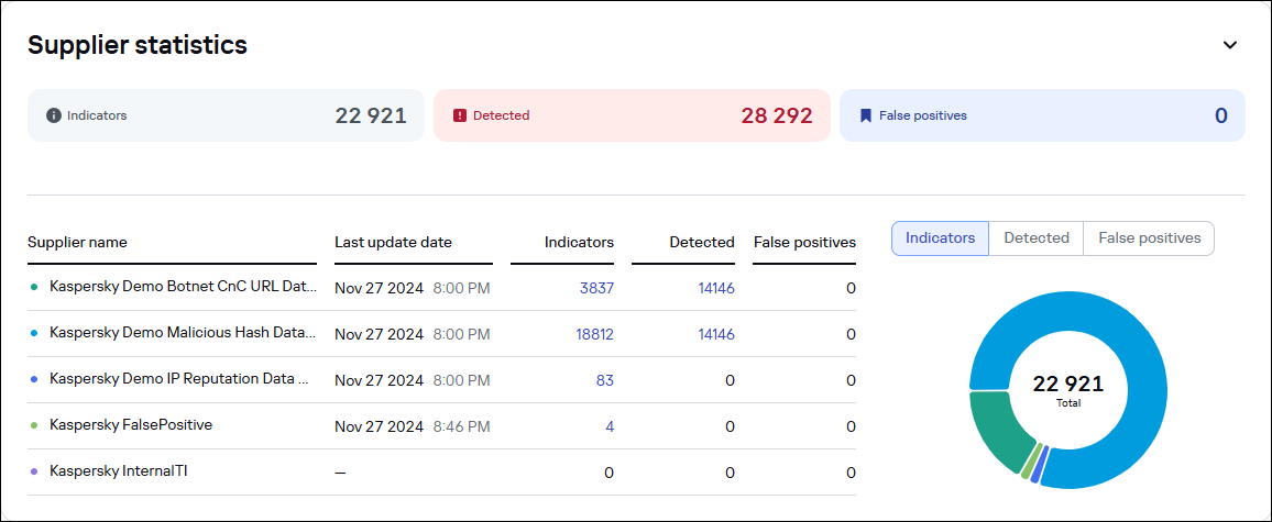
The Dashboard page. The Supplier statistics widget
If the false positives list contains records, the table has a row with Kaspersky FalsePositive in the Supplier name column, and the size of the false positives list in the Indicators column. Other columns in this row contain 0.
If the Internal TI list contains records, the table has a row with Kaspersky InternalTI in the Supplier name column, and the size of the Internal TI list in the Indicators column. The Detected column in this row contains the number of detections against the Internal TI list, and the False positives column contains 0.
Page top