Matching statistics widget
This widget is displayed on the Dashboard page and provides statistics of the checked indicators. The widget contains the following items:
- A badge with the total number of checked indicators of all types
- A badge with the total number of detections for the indicators of all types
In the Data management mode, clicking the badge opens the Detections page. There, the values are filtered according to the period specified in the dashboard settings.
- A badge with the total number of false positive indicators of all types
This badge is shown only if the display of false positives is enabled in the dashboard settings.
In the Data management mode, clicking the badge opens the Indicators page. There, the values are filtered according to the period specified in the dashboard settings, with the False positives filter enabled.
- A table with the statistics of the checked indicators
The table contains the following columns:
- Indicator type
Different types of indicators.
- Checked
Number of indicators of each type (URL, IP address, hash) that are checked by Kaspersky CyberTrace Service.
- Detected
Number of indicators of each type (URL, IP address, hash) that are detected by Kaspersky CyberTrace Service.
In the Data management mode, clicking a value in this column opens the Detections page. There, the values are filtered according to the period specified in the dashboard settings and the selected indicator type.
- False positives
Number of false positives of each type (URL, IP address, hash) that are detected by Kaspersky CyberTrace Service.
This column is shown only if the display of false positives is enabled in the dashboard settings.
In the Data management mode, clicking a value in this column opens the Indicators page. There, the values are filtered according to the period specified in the dashboard settings and the selected indicator type, with the False positives filter enabled.
- Indicator type
- A donut chart that presents the relative numbers of the checked indicators of each type (URL, IP address, hash)
This donut chart is displayed when the Checked button is selected. Hover your mouse over a slice of the ring to view the indicator type, the number of indicators, and the percentage of total.
- A donut chart that presents the relative numbers of the detected indicators of each type (URL, IP address, hash)
This donut chart is displayed when the Detected button is selected. Hover your mouse over a slice of the ring to view the indicator type, the number of indicators, and the percentage of total.
In the Data management mode, clicking a slice of this donut chart opens the Detections page. There, the values are filtered according to the period specified in the dashboard settings and the selected indicator type.
- A donut chart that presents the relative numbers of the false positives of each type (URL, IP address, hash)
This donut chart is displayed when the False positives button is selected. Hover your mouse over a slice of the ring to view the indicator type, the number of false positives, and the percentage of total.
The button and donut chart are shown only if the display of false positives is enabled in the dashboard settings.
In the Data management mode, clicking a slice of this donut chart opens the Indicators page. There, the values are filtered according to the period specified in the dashboard settings and the selected indicator type, with the False positives filter enabled.
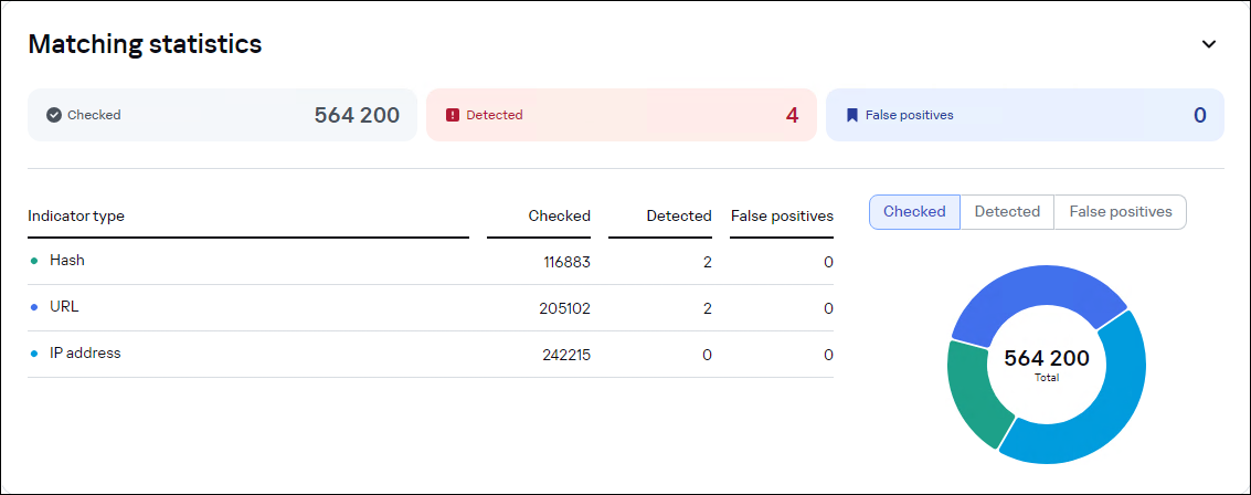
The Dashboard page. The Matching statistics widget