Customizable event-based analytics
You can use the Events widget to get the necessary event-based analytics based on SQL queries. Depending on the selected value of the graph type, two or three parameter tabs are available:
 —this tab is used to define the widget type and to compose the search for the analytics.
 —this tab is used to configure the chart scale. This tab only available for graph types (see below) Bar chart, Line chart, Date Histogram.
 —this tab is used to configure the widget analytics display.
The following parameters are available for the  tab:
tab:
- Graph—this drop-down list is used to select widget graph type. Available options:
- Pie chart
- Bar chart
- Counter
- Line chart
- Table
- Date Histogram
- Tenant—drop-down list for selecting the tenant whose data will be used to display analytics. The As layout setting is used by default.
- Period—drop-down list for configuring the time period for which the analytics must be displayed. Available options:
- As layout—when this option is selected, the widget time period value reflects the period that was configured for the layout. This option is selected by default.
- 1 hour—receive analytics for the previous hour.
- 1 day—receive analytics for the previous day.
- 7 days—receive analytics for the previous 7 days.
- 30 days—receive analytics for the previous 30 days.
- In period—receive analytics for the custom time period. The time period is set using the calendar that is displayed when this option is selected.
The upper boundary of the period is not included in the time slice defined by it. In other words, to receive analytics for a 24-hour period, you should configure the period as Day 1, 00:00:00 – Day 2, 00:00:00 instead of Day 1, 00:00:00 – Day 1, 23:59:59.
- Show data for previous period—a toggle button that lets you enable the display of data for two periods at the same time, including data for the current period and for the previous one. This can be useful for assessing change dynamics.
- Storage—the storage where the search should be performed.
- SQL query field—here you can enter a search query that is equivalent to filtering events using SQL syntax.
For Event widgets, you can use the
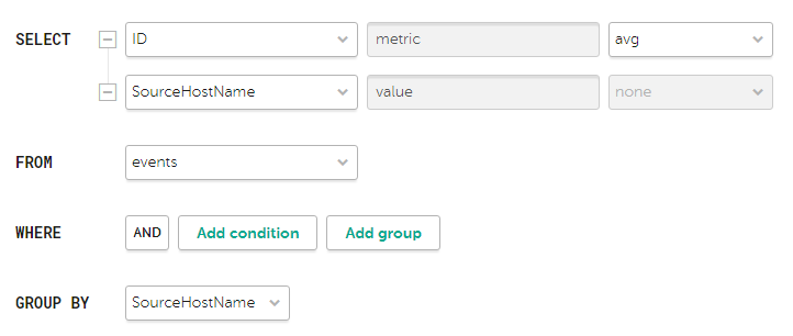
 button to open a query builder that is equivalent to the event filter builder parameters:
Description of query builder parameters
Example of search conditions in the query builder
Aliases must not contain spaces.
The following parameters are available for the  tab:
tab:
- The Y-min and Y-max fields are used to define the scale of the Y-axis. The Decimals field on the left is used to set the rounding parameter for the Y-axis values.
- The X-min and X-max fields are used to define the scale of the X-axis. The Decimals field on the right is used to control rounding of the X-axis values.
Negative values can be displayed on chart axes. This is due to the scaling of charts on the widget and can be fixed by setting zero as the minimum chart values instead of Auto.
- Line-width and Point size fields are available for Line chart graph type and is used to configure the plot line.
The following parameters are available for the  tab:
tab:
- Name—the field for the name of the widget. Must contain from 1 to 128 Unicode characters.
- Description—the field for the widget description. You can add up to 512 Unicode characters describing the widget.
- Color—the drop-down list to select the color in which the information is displayed:
- Default—use your browser's default font color.
- green
- red
- blue
- yellow
- Horizontal—turn on this toggle switch if you want to use horizontal histogram instead of vertical. This toggle switch is turned off by default.
When this option is enabled, when a widget displays a large amount of data, the horizontal scrolling will not be available and data will be fit into the widget window. If there is a lot of data to display, it is recommended to increase the widget size.
- Show legend—turn off this toggle switch if you don't want the widget to display the legend for the widget analytics. This toggle switch is turned on by default.
- Show nulls in legend—turn on this toggle switch if you want the legend for the widget analytics to include parameters with zero values. This toggle switch is turned off by default.
- Decimals—the field to enter the number of decimals to which the displayed value must be rounded off.
- Period segments length (available for Date Histogram graph types)—drop-down list for selecting the duration of the segments into which you want to divide the period.
